
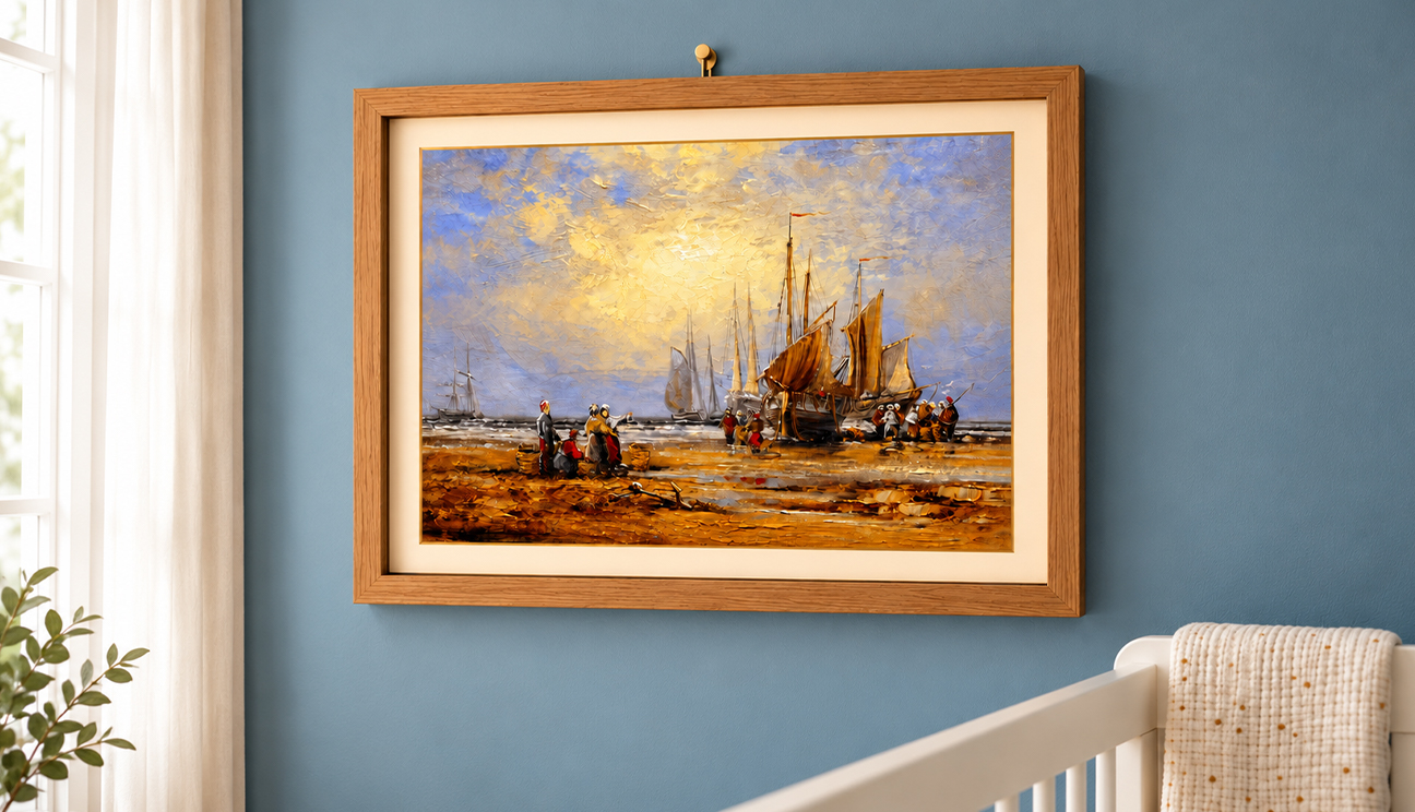
The Ultimate Guide to Styling Oversized Decorative Artwork in Small Apartments
Small apartments often inspire small decorating decisions, but that approach can make limited rooms feel even tighter. Oversized decorative artwork offers a bolder alternative. One generous canvas, print, textile, or sculptural wall piece can simplify visual clutter, create depth, and give an ordinary wall immediate personality. The surprising part is that large art does not automatically overwhelm a compact home. When its scale, color, placement, and surroundings work together, it can make the room appear more intentional and expressive. Before settling for tiny frames scattered everywhere, discover how one commanding piece can help your apartment feel expressive, balanced, distinctly yours.
Why Large Art Works in Limited Rooms
Placing oversized artwork in a small apartment sounds contradictory. If floor space is limited, surely every decorative element should be compact too. Yet small pieces can create a busier appearance, especially when they are scattered across several walls without a clear visual relationship.
One large artwork gives the eye a single destination. Instead of processing numerous frames, objects, and competing details, viewers tend to encounter one confident statement. This creates a calmer visual experience can make the surrounding space feel less fragmented.
Large art also emphasizes height and width. A tall canvas draws attention upward, making the ceiling appear farther away. A wide piece encourages the eye to travel horizontally, which can make a short wall seem broader. The artwork does not physically enlarge the apartment, but it changes how the boundaries are perceived.
This is why scale should not be feared. Used thoughtfully, an oversized piece can bring order, identity, and visual breathing room to an interior that previously felt cramped.
Start With the Wall, Not the Artwork
Falling for an artwork before considering its destination can produce an awkward fit. Begin by studying the walls in your apartment. Look beyond empty space and notice nearby furniture, doorways, windows, switches, shelves, and sight lines from adjoining areas.
Measure both the wall and the furniture positioned against it. Above a sofa, bed, desk, or console, the artwork should feel connected to the furnishing beneath it. If it is dramatically narrower, it may appear disconnected. If it extends beyond the furniture, it can still work, but the arrangement needs enough open wall around it to look deliberate.
Photograph the wall directly from the front. You can then create a rough digital mock up or mark the proposed dimensions with removable tape. Live with that outline for a day. View it while sitting, entering the room, and walking past the area.
This simple exercise reveals whether the scale feels commanding or restrictive before you bring anything home. It also reduces hesitation when you finally find a piece that matches the space.
Choose a Format That Supports the Room
Oversized decorative artwork comes in many forms, and each format affects a small apartment differently. A framed print offers crisp structure, while an unframed canvas feels lighter around the edges. A textile adds softness without the visual weight of glass. A shallow relief introduces shadow and dimension while using very little floor area.
Consider the existing character of your apartment. Rooms filled with straight furniture lines may benefit from an organic composition or rounded form. Softer interiors can gain definition from geometric artwork. The goal is not rigid matching. It is creating a useful contrast that keeps the room lively.
Physical weight matters too. Renters may prefer canvas, fabric, or lightweight panels because these can be easier to position with suitable mounting methods. Deep frames and sculptural works require stronger support and greater attention to wall construction.
Select a format that suits both the visual mood and the practical limits of the property. Attractive art becomes far more enjoyable when displaying it doesn’t create ongoing difficulty.
Use Color to Expand Rather Than Crowd
Color strongly influences whether oversized artwork makes a room feel open or enclosed. A piece does not need to match the apartment exactly, but some connection with the surrounding palette will help it settle naturally into the space.
Artwork containing lighter areas can bring visual air to a narrow wall. Cool colors may create a sense of distance, while warm shades can make the display feel closer and more energetic. Dark compositions can also work beautifully, particularly when balanced by pale walls, reflective surfaces, or generous natural light.
Try identifying one or two colors already present in the room. They might appear in the rug, curtains, upholstery, books, or ceramics. Find artwork that repeats those shades while introducing something unexpected. This creates continuity without making the room look overly coordinated.
Avoid repeating every color from the artwork throughout the apartment. That approach can turn an expressive piece into a decorating formula. A few quiet echoes are enough. Let the artwork bring its own voice while maintaining a loose conversation with everything around it.
Position It at a Human Height
Oversized artwork is often hung too high because people tend to assume a large piece needs more wall beneath it. In reality, excessive height can make the artwork feel detached from both the furniture and the people viewing it.
Use the center of the artwork as your primary reference. It should generally sit near a comfortable standing sight line, although furniture may require slight adjustments. When hanging above a sofa or console, leave enough separation to prevent crowding, but not so much that the artwork appears to float toward the ceiling.
Check the position while seated as well. In a compact living room, much of the artwork may be viewed from the sofa rather than from a standing position. The composition should feel accessible and connected from that angle.
Apartments often contain overlapping sight lines, so observe the piece from the entrance, dining area, and nearby hallway. A placement that looks balanced straight ahead may feel unusually high from another position. Testing several viewpoints helps the artwork become part of the whole apartment rather than one isolated wall.
Let Negative Space Do Its Job
A large artwork needs room around it, even inside a small home. Negative space is not wasted space. It separates the piece from surrounding objects, strengthens its silhouette, and gives viewers a moment to absorb what they are seeing.
Remove nearby frames, shelves, or ornaments before deciding that the new artwork feels too large. The issue may not be its dimensions. Competing elements could be preventing it from settling into the wall.
This does not mean the area must remain empty. A restrained lamp, low console, plant, or single ceramic object can create a supportive arrangement. Keep those additions visually quieter than the main piece. Their role is to ground the composition, not compete for attention.
Pay attention to the outer edges of the artwork. If they nearly touch curtains, cabinets, or adjacent walls, the arrangement may feel compressed. Even a modest border can make a meaningful difference.
Giving one substantial piece more room often creates a cleaner result than distributing several smaller decorations across every available surface.
Balance the Artwork With Furniture
Oversized artwork becomes convincing when it relates to the furniture rather than hovering independently. Think of the wall and the objects beneath it as one composition. Their widths, shapes, colors, and visual weights should communicate without appearing identical.
A broad horizontal canvas can complement a long sofa. A vertical work can add height beside a compact reading chair or a narrow cabinet. Circular artwork can soften boxy furniture, while an angular piece can bring definition to curved upholstery.
You can also use asymmetry. An artwork placed slightly off center may balance a tall lamp or plant on the opposite side. This approach feels dynamic and can solve layouts where doors, windows, or switches make centered placement impossible.
Do not fill every gap simply to create symmetry. Small apartments benefit from edited arrangements because fewer objects make each choice easier to notice. Step back frequently and ask whether the furniture supports the artwork or fights it.
The strongest setup often contains a commanding piece, a grounding furnishing, and one subtle accent. Anything else should earn its position.
A Bigger Statement Can Create a Calmer Home
Small-apartment styling is not a contest to fit endless decoration into limited square footage. It is the process of deciding which objects deserve visibility. Oversized decorative artwork supports that approach by replacing scattered visual noise with one expressive focal point.
Measure the wall, explore suitable formats, observe the room’s colors, and test placement before committing. The give the chosen piece enough negative space to work. Support it with restrained furniture and accessories rather than surrounding it with competing details.
The result can feel surprisingly spacious. One substantial image encourages the eye to pause instead of jumping between numerous objects. It can establish a zone, create depth, add personality, and connect several viewpoints at once.
The bottom-line is: your apartment doesn’t need larger rooms to carry large ideas. It needs confident choices shaped around the space you actually have. Find the artwork that holds your attention, understand its dimensions, and imagine how it will influence the entire room.
